PugetSoundScape Redesign
September 2017 - Present
My Work: Work involved in the redesign includes examining organization improvements, examining new design themes, analyzing similar local websites, and creating wireframes of the proposed new layout.
Skills Applied: Information Architecture, User Experience, Wireframing
Overview
PugetSoundScape is a blog website I created in June 2013 with the original purpose being to cover the spatial aspects of the Seattle area, including development, buildings, parks, and overlooked features and histories.
In September 2014, the website also became a place to post the Seattle Skyscraper Projects Infographic, and updates have continued to be posted every six months. Other content has not been posted on the website since mid-2015.
Since the website was created, the site uses a WordPress theme which is not able to meet current design needs such as responsive design for different browser sizes. Additionally, the theme has not been updated by the creators since 2015. As a result, the website theme needs to be changed to a new one which can meet current web design standards.
This also provides the opportunity to redesign the website layout to better organize and present content. This also comes with a revamp of the website content.
The Process
Original Situation
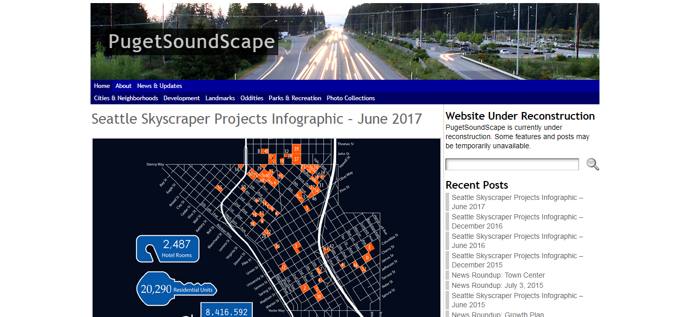
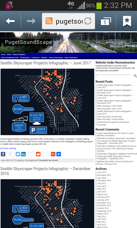
Current home page of PugetSoundScape
The website has a header with the site name overlaid over a photo banner. The banner was intended to be changed periodically, but the original banner has remained since the website’s creation.
Below the header is a two-row navigation bar, with the top row featuring pages related to the website itself, and the bottom row featuring post categories.
Below this, the right column contains a search field, latest posts section, latest comments section, archives section with links based on month and year, and categories section. The left column shows latest posts, or the full post or page depending on the page type.
The footer contains copyright and website information.
Improving Navigation
Many posts on the website are categorized by topic and tagged by location, while many others are uncategorized and untagged. Currently, the navigation bar links to static manually-maintained topic/category pages containing post links organized by location/tag. A section in the right column links to WordPress’s automatically-maintained category pages containing abbreviated posts sorted by date.
The post link pages were intended to be an improvement over WordPress’s category pages, by having tags as an additional method of organization. However, this way requires manual updates to add new post links, can create difficulty with organizing posts in multiple categories or tags, and can create difficulty modifying categories and tags. Additionally, tags play a minor role for organization on the website and on other similar websites.
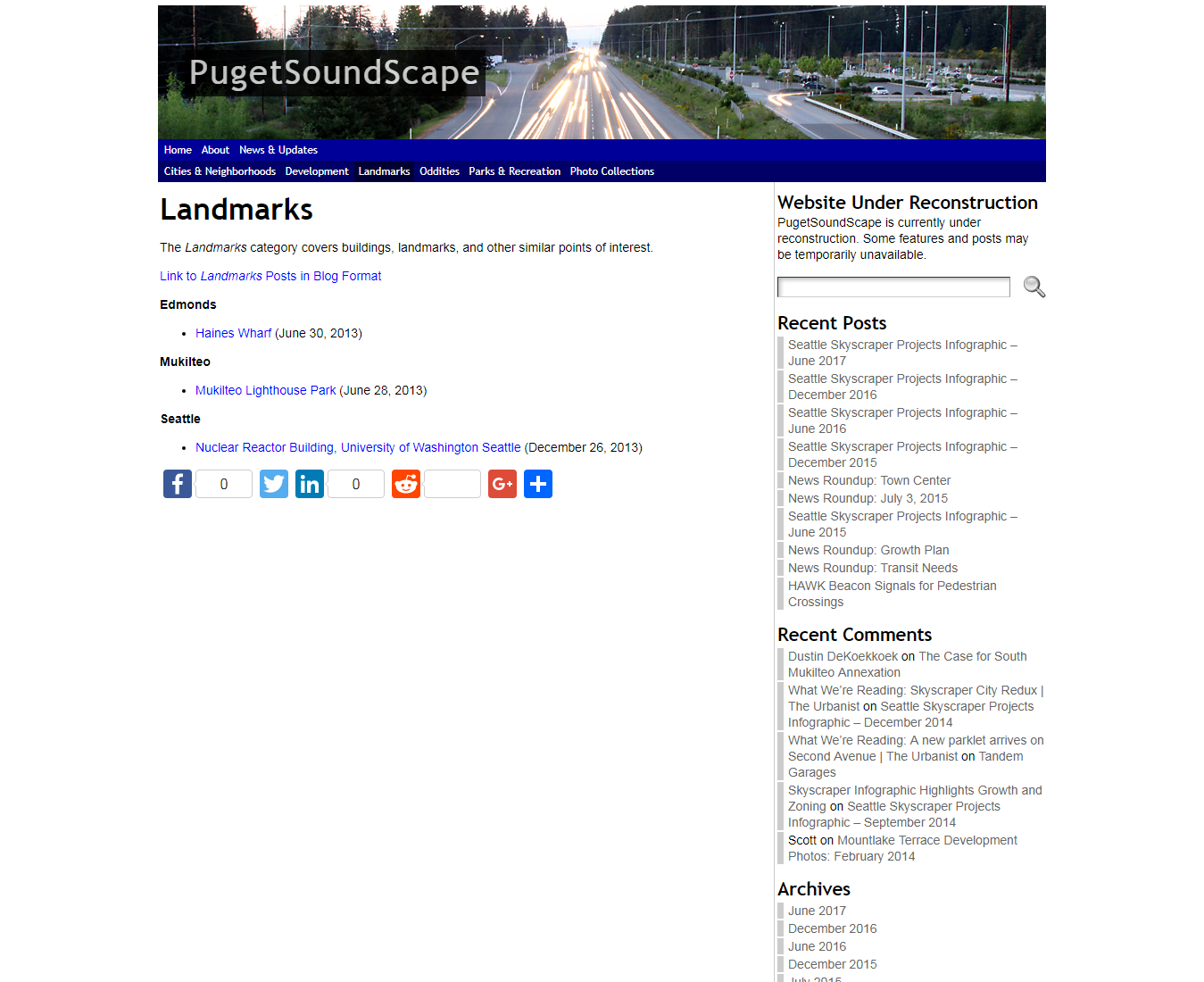
Landmarks post link page
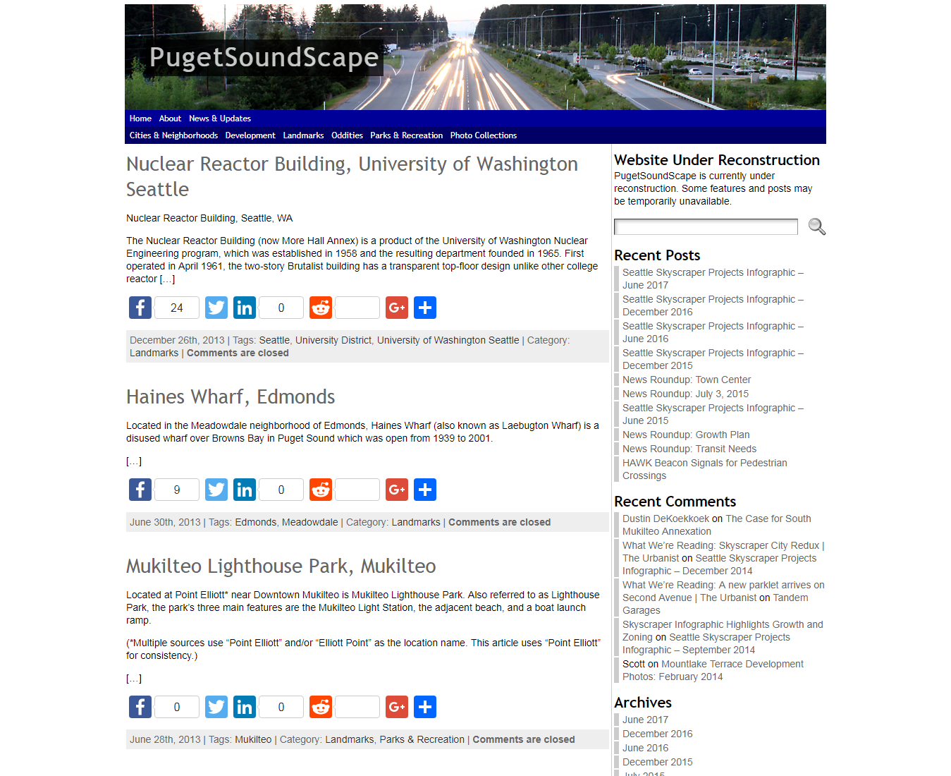
Landmarks category page
Given the disadvantages of manual post link pages combined with the available automated category pages, it is best to remove the post link pages and only have the category pages for viewing posts by category. Sorting posts by both category and tag does not appear to be useful enough to provide, and is not implemented on other similar websites. The search function would be feasible for finding articles with the desired tag.
Improving the Navigation Bar
With the removal of the post link pages, the navigation bar would instead link to topic/category pages. To accommodate categories on the new bar, drop-down menus where the categories are shown when hovering over the topic link on the bar would be used.
With these, the only manual changes needed are adding new categories to the menu. The number of categories is high enough that they may not fit on the navigation bar on smaller browser sizes, but should not be high enough that a drop-down menu would be hard to view on a browser.
To provide a way to view posts by location, the bar could also link to location/tag pages which operate in the same way as category pages. This depends on how tags would be reorganized during the redesign.
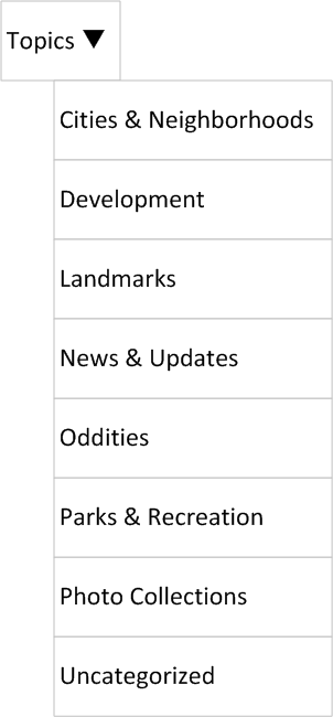
The About page would also be linked from the navigation bar, as well as any future pages regarding website information or such as special features. The home page link may be kept or removed, since the name/logo already links to the home page. The News & Updates page regarding website news would be turned into a category. The new bar would only have one row for links instead of two, and would have a simpler appearance on the website for desktop viewers.

New navigation bar wireframe
Category page drop-down menu wireframe
Improving Design
With the current WordPress design, the website keeps the same layout on desktop and mobile browsers. On desktop browsers, if the window is narrower than the page (about 1000 pixels) viewers have to scroll left and right. On mobile browsers, the website is scaled down to the width or slightly wider than the width of the screen, and font sizes may be incorrectly scaled to the layout.
Home page on Samsung Internet Browser on Android
Home page on Chrome on Android
While the design is adequate for desktop viewers, it is not for mobile viewers who have to contend with small text and links requiring viewers to zoom in and scroll around, and may find some things incorrectly displayed. With a new design, the website will have a responsive design that can adapt to browser sizes and meet current web standards.
With a new design comes the opportunity to redesign the site layout to better display content. The new layout would take into account accommodating desktop and mobile browsers, and would allow more spacing between page content.
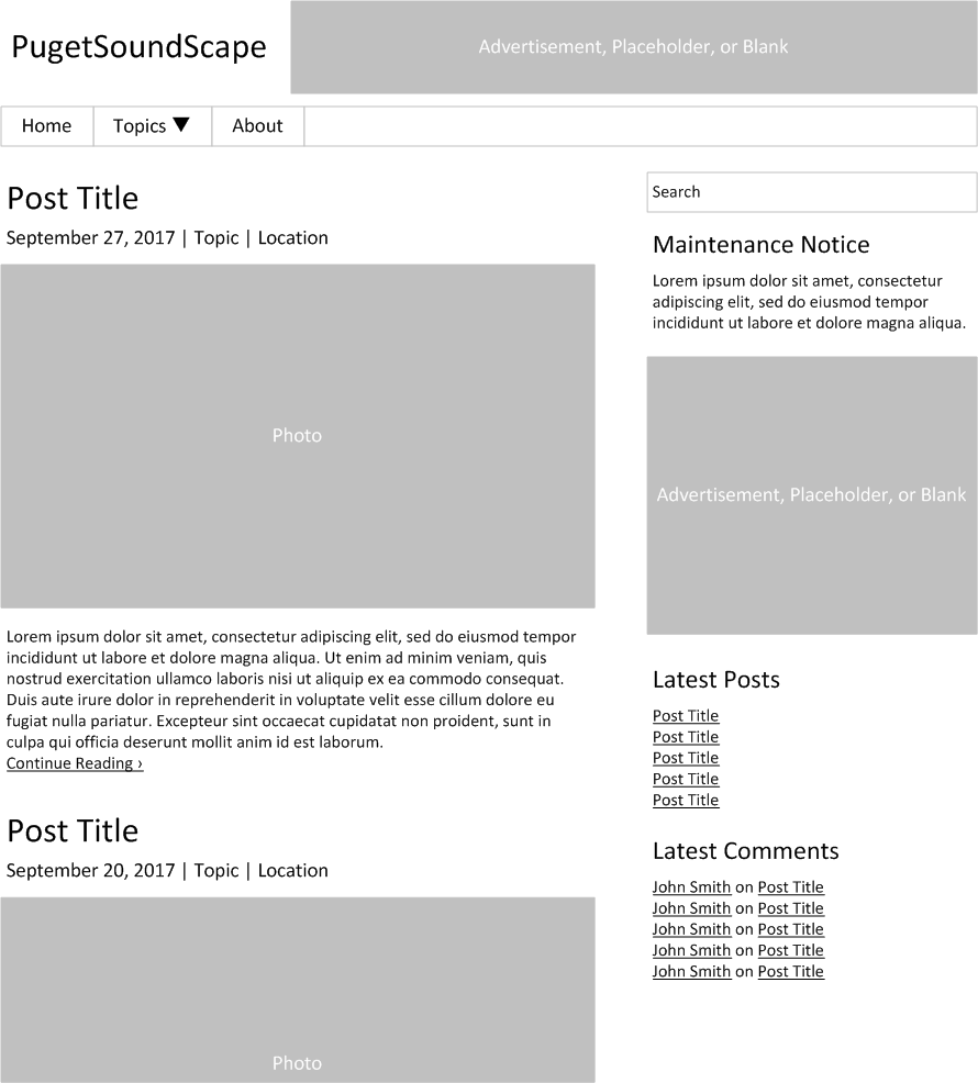
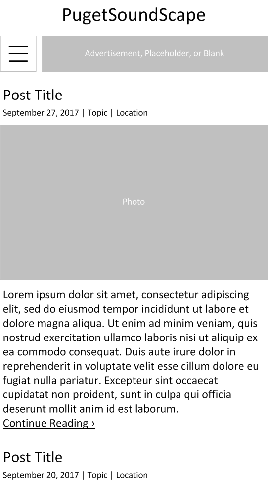
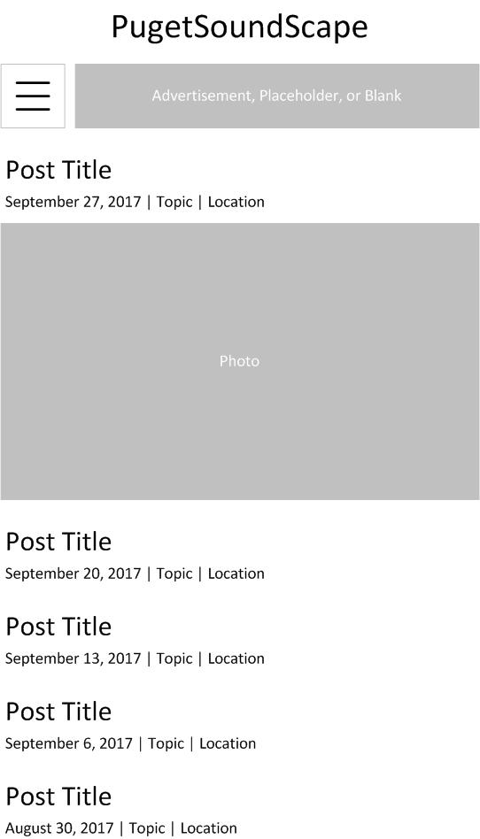
Proposed home page wireframe
In the header, the site name will no longer be overlaid over the photo banner, with the name occupying the left side of the row and the banner in the rest of the row instead. The banner may be kept as a rotating photo, replaced with a graphic placeholder image, or left blank. It may be replaced with ad space in the future. The navigation bar would be below the header.
The right column would be reorganized to have more relevant data in better locations. The search bar would be at the top, followed by any notices such as website maintenance.
Below this would be advertising space which may be added in the future, or a graphic placeholder image may be added. Below this would be the latest posts and latest comments sections.
Any future sections in the right column would be added below or between the preexisting sections, depending on how important the content is.
The archives section and categories section would be removed from the right column, since the former is an uncommonly-used way to find articles, and the latter would duplicate the new category page links in the navigation bar. If a site map page is added, these sections would be added to it, and would also include a tags section and other links.
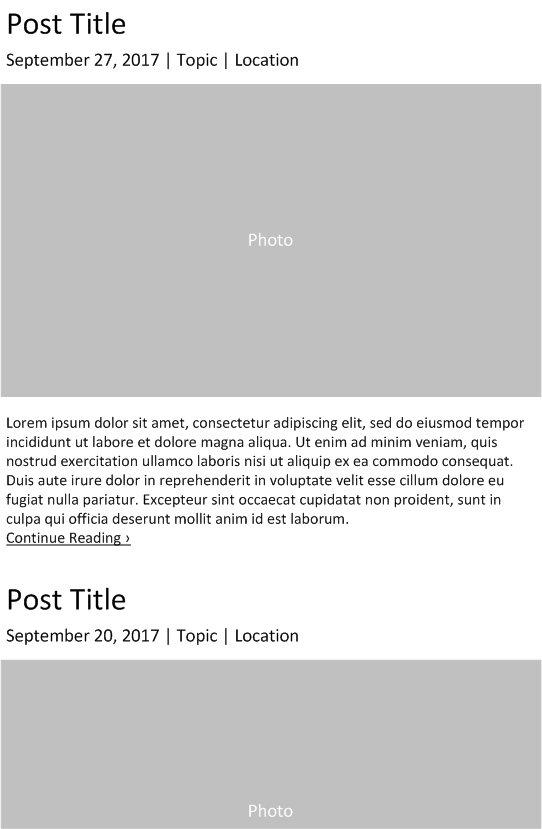
Latest posts section wireframe
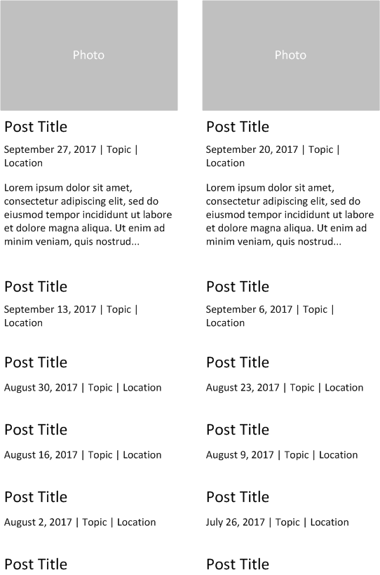
Latest post links section wireframe
On the left column of the home page, two ways of displaying posts are a latest posts section (left wireframe) or using latest post links (right wireframe). The latest posts section method is currently used on the website. Its use of abbreviated posts provides viewers with an idea of what the post is about, while limiting how much of the article is shown in order to preserve space on the home page.
Having post links saves more space and allows more articles to be shown on the home page, but does not provide a way for viewers to read the first parts of posts. It also may require writing post excerpts for posts, which currently does not occur.
Latest posts sections are typically found on blog websites with new posts at most one or two times per day, while latest post links are typically found on more traditional news websites with multiple posts per day. Other area blog websites covering similar issues all use latest posts sections.
The latest posts section method is the preferred option for the redesigned website, due to it being the standard option for blog websites, the frequency of posts on the website, and the advantages of having abbreviated posts for viewers.
Social media links and buttons for individual posts would not be viewable on the home page, but would still be featured on the post pages themselves.
The footer would continue to contain copyright and website information, in a basic text section.
Improving Mobile Design
Mobile home page with latest posts section wireframe
Mobile home page with latest post links wireframe
The mobile version would have the header and navigation button at the top, and page/post content below. The right column contents would be below the page/post content, organized in the same order as in the desktop version.
On the home page, the page content would have either a latest posts section (left wireframe) or only latest post links due to space constraints (right wireframe), depending on the final WordPress theme and design. A latest posts section like what is found on the desktop version is the preferred option.
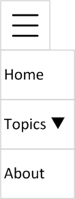
Mobile navigation menu wireframe
The navigation button opens the menu, with the links ordered the same as in the desktop navigation bar, with the categories link opening secondary menus.
Mobile category page drop-down menu wireframe
The Outcome
The new WordPress theme will be determined in the future, and any wireframe changes needed to fit the new theme would be performed.
The website will remain functional during the redesign process, with downtime during major changes to the design or theme. Other changes include reorganizing categories and tags.
Progress on the redesign and revamp is ongoing.