Informatics Capstone
January 2014 - June 2014
My Contribution: My main role was to act as the project manager, with responsibilities including the scheduling and reviewing of project milestones, and the operation of the milestone website.
Additional roles include research, facilitating user testing of the application, working with the other capstone project members on different tasks, and analyzing the desktop and mobile user interfaces for effectiveness.
Skills Applied: Branding, Project Management, Usability Testing, User Flows, User Personas, User Surveys, User Experience
Group Members: Drew Blaisdell, Jace Morrison, Kassia Wilhelm, Nathaniel Williams
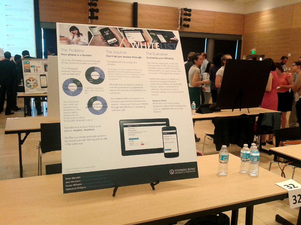
Poster during Informatics Capstone presentations
Overview
For the Informatics program at the University of Washington, my capstone group created a mobile application called Whitelist, a service which utilizes a secondary phone number to only allow phone calls and text messages from pre-approved phone numbers. The app serves an opposite to the more common blacklist.
The application was planned and developed over six months, with periodic milestones and deliverables during the six months. The application was presented at a capstone presentation in June 2014.
The Process
The Milestone Website shows the processes done by the team for creating the product, with each person contributing to the milestones. Featured below are several processes I participated in.
Surveying
We created a survey about mobile phone use to provide research data, which included questions about what kind of mobile phone one uses, how often one calls and is called, and how often one sends and receives text messages.
Additional questions included how often one is contacted from an unknown phone number, and how they react and deal with these contacts. Demographic questions including age and gender were also asked.
Results from the survey contained a wide range of answers, and survey takers tended to be younger.
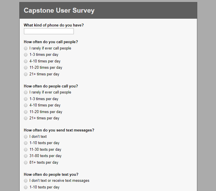
Mobile Phone Use Survey Portion (Group Work)
User Personas
From the survey results, we created two personas for use during project planning and design, representing archetypes based on target demographics. The personas allowed us to form our product to better fit the needs of potential users, by providing a product focus with needs and goals.
The first persona is the "High Profile" persona, represented by a corporate executive who frequently uses a mobile phone for business purposes, values time and efficiency, and has some issues with maintaining contact with multiple people.
The other persona is the "Traditionalist" persona, represented by a working father who uses a mobile phone for personal and business purposes, values privacy and time with family and friends, and feels a mobile phone can sometimes get in the way of life.
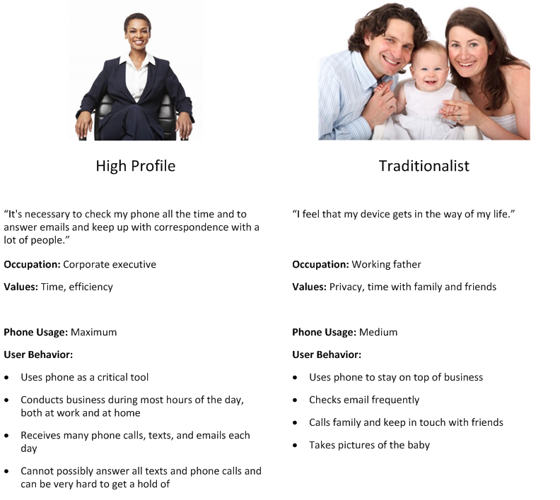
User Personas (Group Work)
User Flows
The user flows diagram shows potential ways a user would interact with our web application. The diagram is used to guide how the application would be designed to work with a potential user's needs.
The diagram features three user flows showing how the application handles incoming calls, and how the user interacts with incoming calls with the application.
There are three user flows shown in the diagram, with the third flow adopting steps from the two other flows. All three flows start out with a user receiving a phone call from an unknown phone number.
The user flows show scenarios where the first call from an unknown number is handled, and how the user reacts to the contact. This includes approving the call and adding the number to the application's whitelist to allow future calls, or rejecting the call and having it automatically ignored in the future.
The user flows also show scenarios where later calls from an unknown number are handled, including sending calls directly to voicemail, and fully blocking the call with no opportunity for a voicemail.
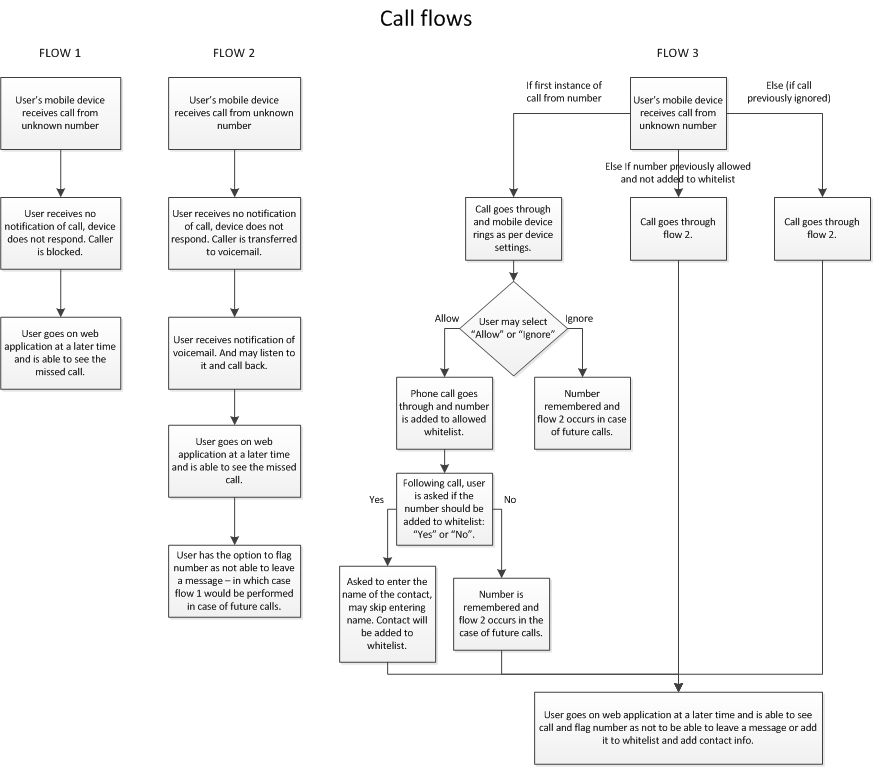
User Flows Diagram (Group Work)
Wireframing
Wireframes of the application were created to show how the final product could be organized and designed, and to provide a guide for further design and development work for the application. They can also visualize scenarios such as ones identified in user flows.
Wireframes created include two sets of high-fidelity wireframes. The first set shows different user actions, such as adding phone numbers to the whitelist, and viewing contact history with the option to select numbers to add to the whitelist. This set of wireframes uses an iOS-style user interface.
The second set shows two scenarios from the user flow diagram, including one where a call from an unknown phone number is sent directly to the voicemail, and another where a first call from an unknown phone number is accepted or rejected, with the user given the option to add the number to the whitelist. This set of wireframes uses an Android-style user interface.
The wireframes were created by other group members and can be found here. Wireframe design was discussed and determined by the group.
Branding
During development, Whitelist was the working name of the application. Before publication of application materials, the name of the application was determined by the group.
Potential names included Whitelist, WhiteList, WhiteLister, ClearList, and GlassList, and was narrowed down to Whitelist/WhiteList and ClearList.
Whitelist was the name chosen due to it being the same as the generic term "whitelist", an uncommonly-known term according to feedback from application testers.
ClearList was the second choice, since it was a brand name and did not use the generic term "whitelist". It was not chosen because the name did not adequately convey the application's purpose compared to Whitelist.
The visual appearance of the application is one with a clean and minimal format, reflecting the name of the product and allowing for better focus on the content of the product.
A simple format also can adapt better to mobile devices, due to space constraints on screens, the need to be succinct in understanding when used on devices, and differing operating system user interface designs.
The Result
Product Overview
Many cell phone users want to control who can contact them, but do not want to deal with having to block specific numbers. They want to allow specific numbers instead.
Whitelist is a service which gives users a secondary phone number, with the ability to create a whitelist of phone numbers allowed to contact the user on the secondary number, and other numbers handled in another way specified by the user.
Whitelist is intended to be a better solution for these people than the more commonly found blacklist, which only blocks specified numbers and allows all others, making it an inconvenient option to use.
Whitelist includes a web application which manages the handling of calls for filtering unwanted contacts, and allows users to modify application settings.
There is also an Android application which provides access to web application features, and also includes the feature of adding recently received contacts to the whitelist.
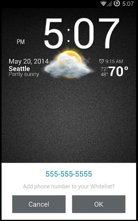
Adding number to whitelist feature